
Grateful Coffee
Grateful Coffee is a specialty coffee brand centered on ritual, gratitude, and intentional living. The identity blends restrained minimalism with cathedral-inspired typography and symbolic praying hands iconography to create a calm yet distinctive presence. The resulting system elevates everyday coffee into a moment of reflection, translating seamlessly across packaging, merchandise, and brand touchpoints.

Context
Grateful Coffee was positioned as a mindful, design-forward coffee brand appealing to consumers who value intention, quality, and daily ritual. The brand needed to stand apart from both rustic craft coffee aesthetics and brightly colored contemporary packaging, instead conveying quiet reverence and simplicity. The visual identity needed to feel premium, timeless, and cohesive across product and lifestyle applications.

CHALLENGE
The core challenge was balancing minimal restraint with strong shelf presence. The brand needed to communicate specialty quality and spiritual undertone without feeling religious, ornate, or inaccessible. Packaging also needed to support multiple roast varieties while maintaining a unified system that reinforced recognition and brand equity.

APPROACH
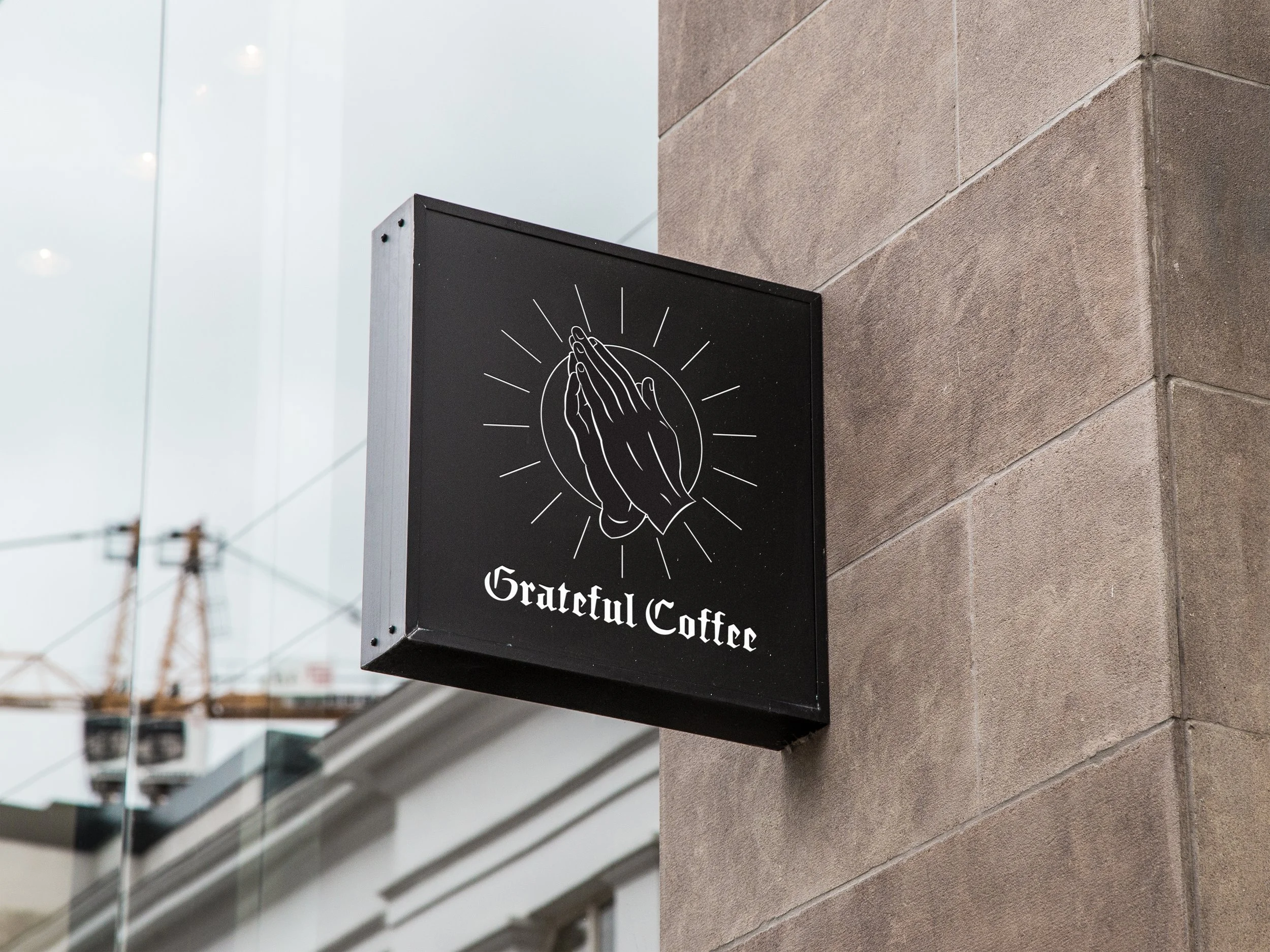
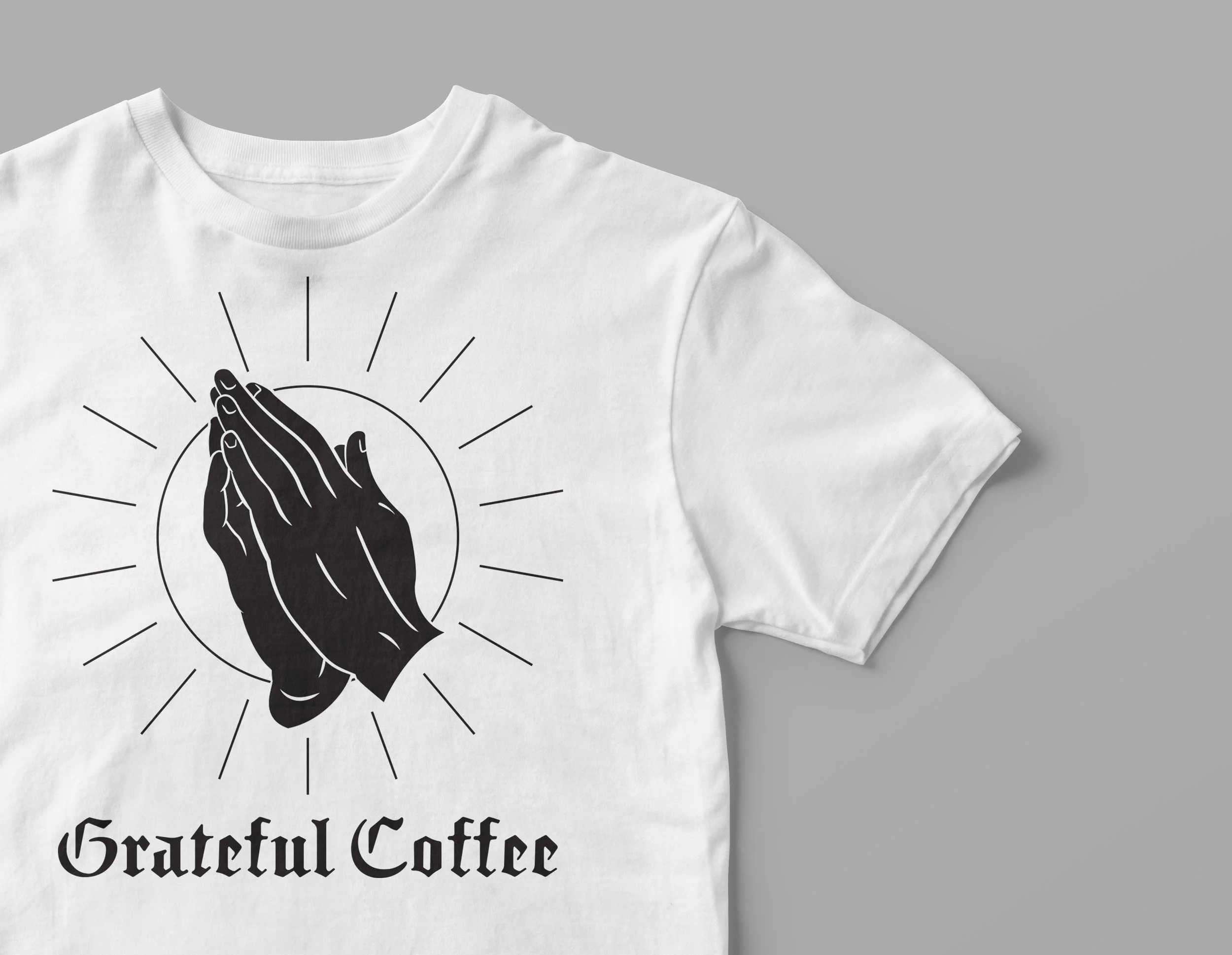
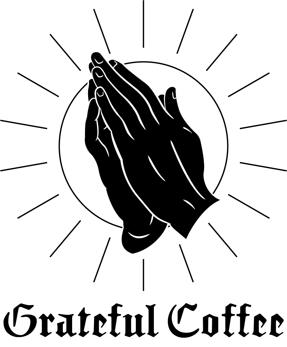
The design approach centered on reducing visual elements to their most symbolic forms. A simplified praying hands mark was paired with blackletter-inspired typography to evoke cathedral architecture and heritage craft, while maintaining modern clarity through spacing and hierarchy. Neutral tones and disciplined composition created a quiet, contemplative mood that could scale across packaging and brand materials.
DESIGN System
The visual system combines a refined monochrome palette, cathedral-influenced wordmark, and centered icon composition to create immediate recognition. Consistent layout structure allows roast information to vary while preserving brand integrity. Generous negative space and typographic restraint reinforce the brand’s calm presence. The system extends naturally across bags, labels, merchandise, and print collateral while maintaining a cohesive ritual aesthetic.
OUTCOME
The resulting identity positions Grateful Coffee as a distinctive, premium presence within the specialty coffee landscape. The restrained visual language differentiates the brand on shelf while reinforcing themes of gratitude and intentional ritual. The flexible system supports product line expansion and lifestyle applications, establishing a recognizable and enduring brand foundation.