
Whitecap Brewing
Whitecap is a craft brewery brand inspired by alpine landscapes and snow sport culture. The identity blends bold vintage illustration, high-contrast color, and expressive typography to create a distinctive presence across packaging, merchandise, and environments. The result is a high-energy visual system that captures the spirit of mountain adventure while standing out on shelf and in lifestyle contexts.

Context
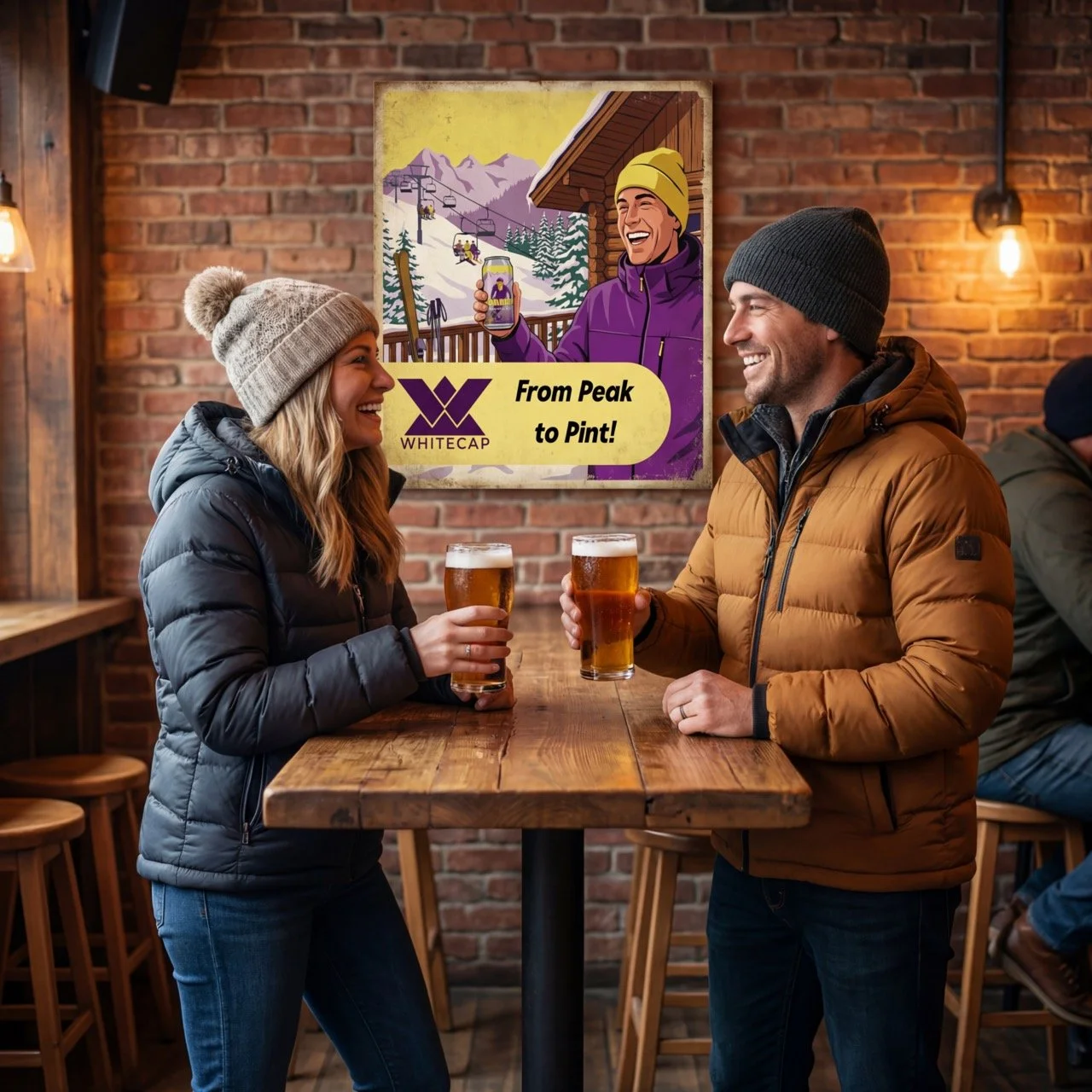
Whitecap was positioned as a modern craft brewery rooted in mountain culture — appealing to skiers, snowboarders, and outdoor enthusiasts who value both adventure and quality beer. The brand needed to feel authentic to alpine environments while differentiating from the rustic or vintage aesthetic common in craft beer. The visual direction needed to translate seamlessly across cans, taproom materials, and lifestyle touchpoints.

CHallenge
The primary challenge was creating a brewery identity that felt energetic and contemporary without losing a sense of place. The brand needed to communicate multiple beer varieties clearly while maintaining a unified look across packaging. It also needed to resonate both on shelf and in mountain resort settings, balancing bold visibility with lifestyle credibility.

Approach
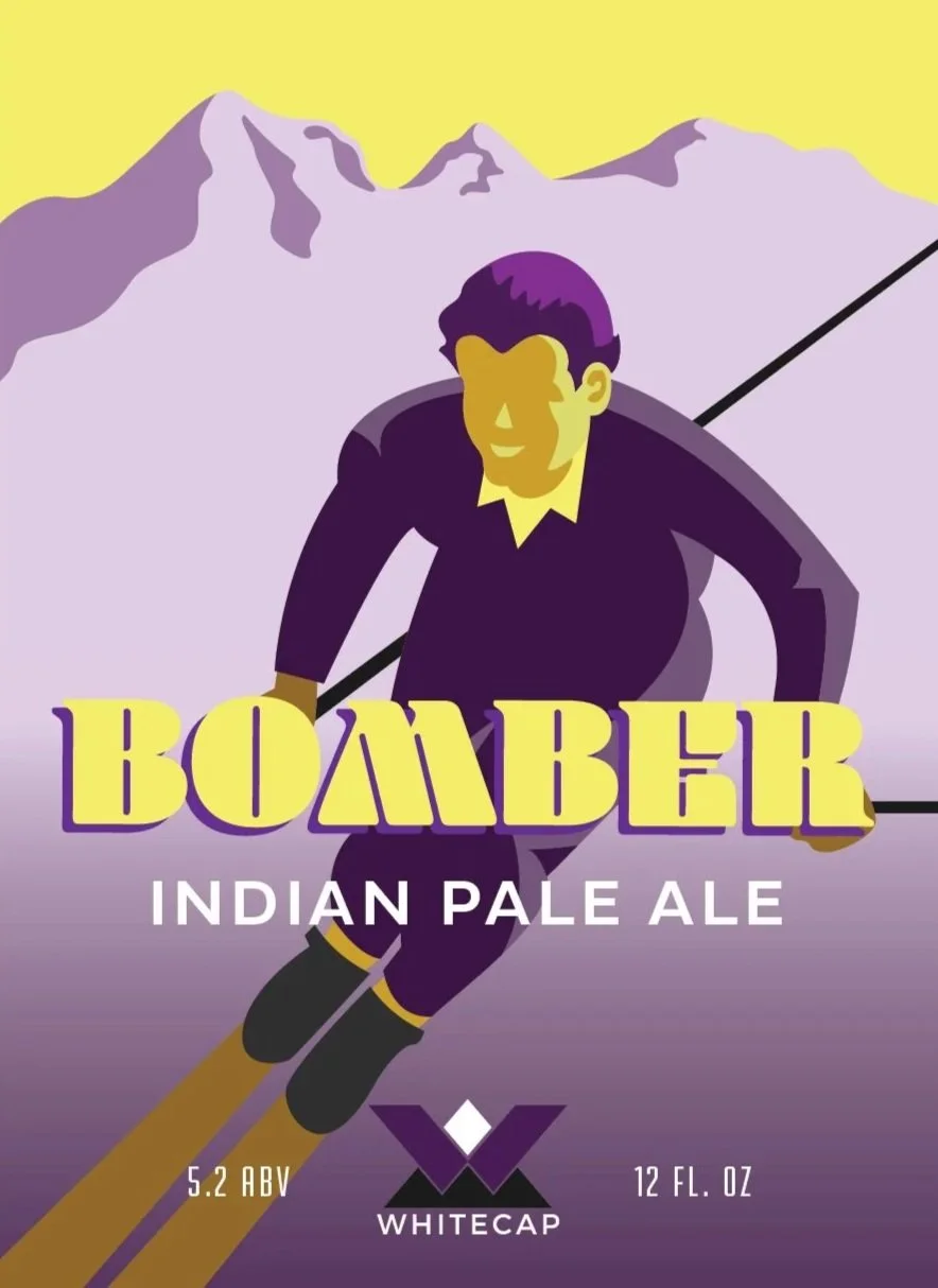
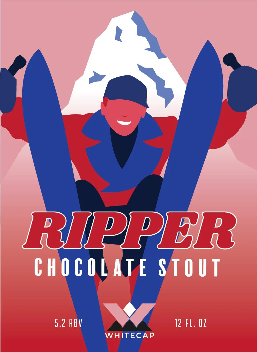
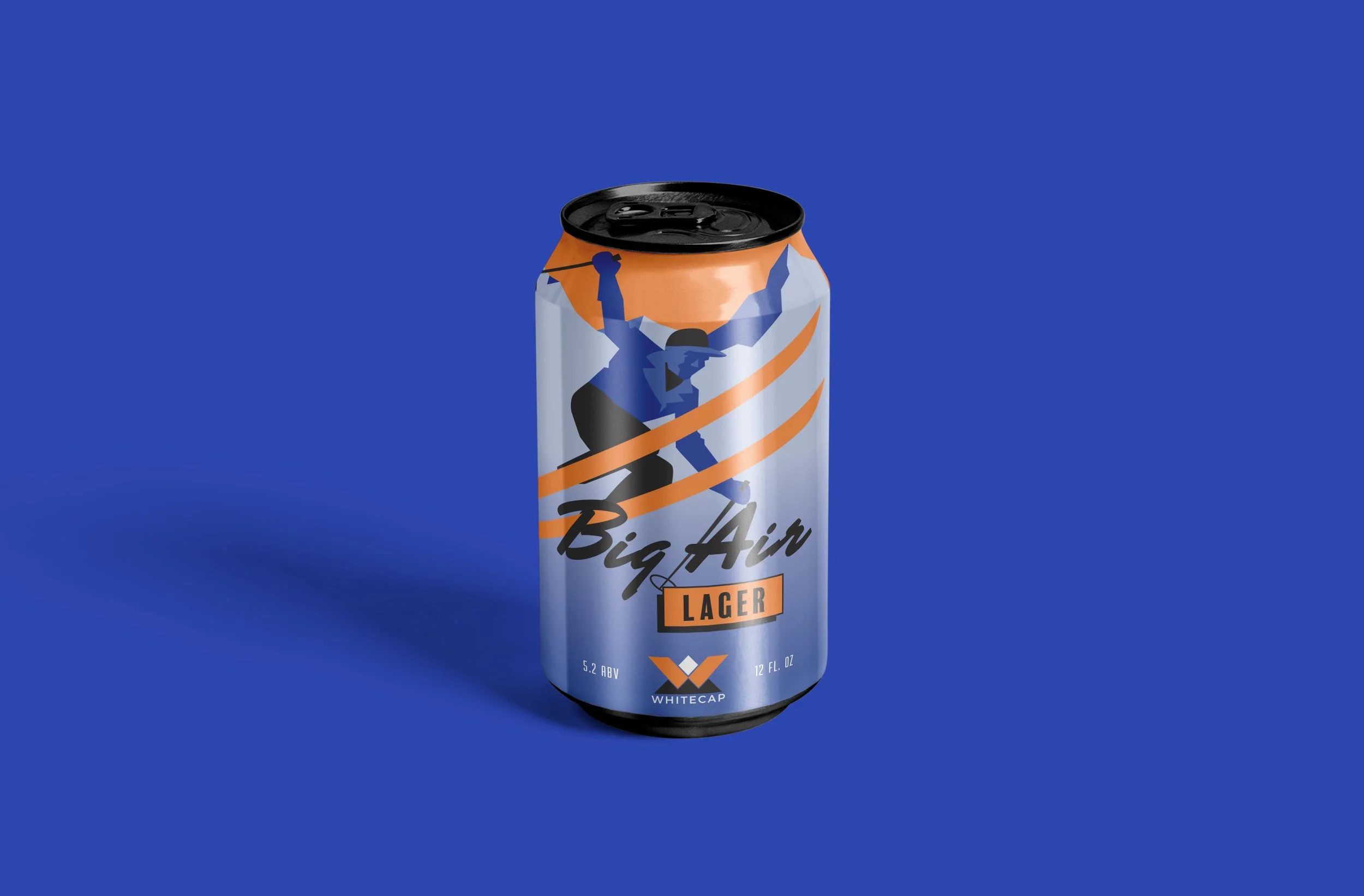
The design approach centered on translating snow sport movement and mountain forms into a vintage illustration style. Each beer variety was paired with a distinct athlete persona and color palette while sharing consistent compositional structure, typography, and iconography. This created a flexible system that could expand across packaging, merchandise, and brand environments while maintaining strong recognition.
Design System
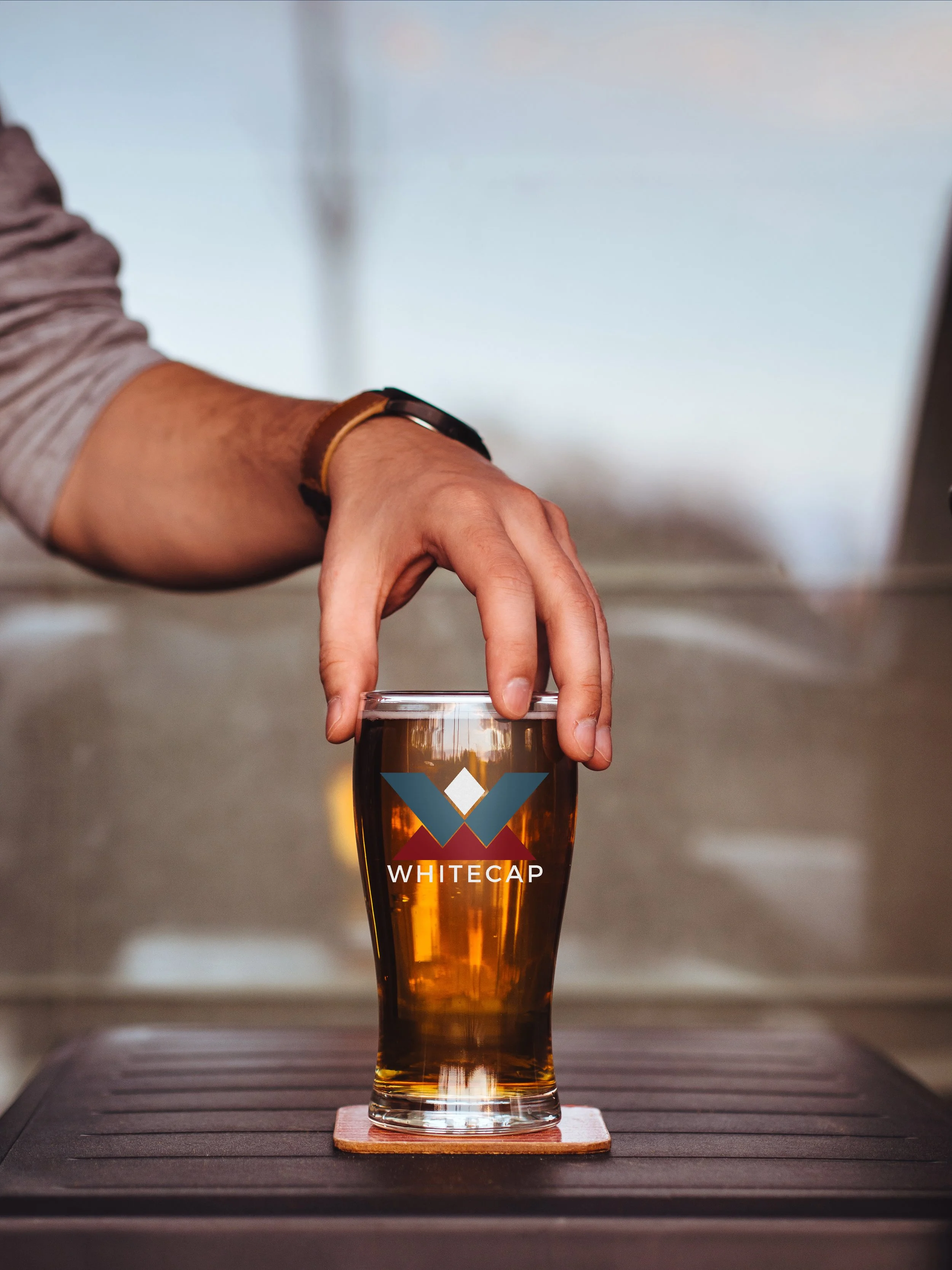
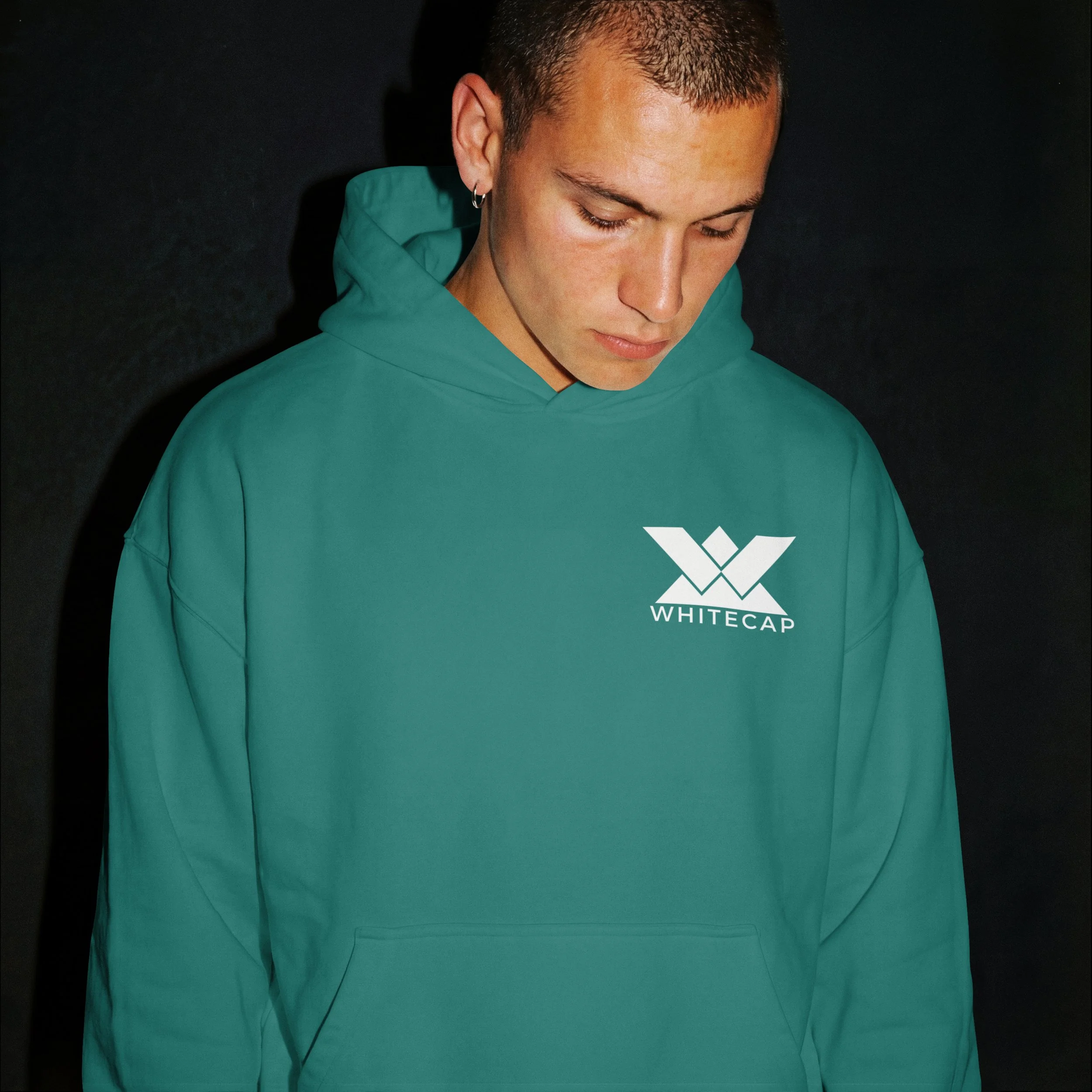
The visual system combines angular alpine shapes, dynamic athlete illustrations, and saturated color fields to create instant shelf impact. A consistent layout structure anchors product hierarchy while allowing each variety its own personality. The Whitecap “W” mark functions as both brand signature and adaptable graphic element across applications. The system scales across cans, posters, apparel, and environmental graphics, maintaining cohesion while supporting variety differentiation.


Outcome
The resulting brand establishes Whitecap as a bold, contemporary presence within the craft beer landscape. Distinct colorways and character illustrations create strong product recognition, while the cohesive system supports expansion across new varieties and touchpoints. The identity translates naturally into mountain resort and outdoor lifestyle contexts, reinforcing the brand’s connection to alpine culture and adventure.